A bit of redesign for the wiki
You may have noticed that we have updated our header image recently. About six years after the game has been renamed "Fallen London", we too have finally acknowledged that fact.
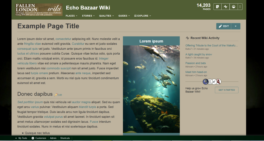
With the Fallen London redesign close to release, we are considering also updating the wiki layout a little. I have prepared a new colour scheme that consists of colours actually used for the game. With the new palette, the site will looks like this:
(The image is just a placeholder, automatically put there by the wikia theme preview.)
If you have any thoughts or suggestions, please let us know.
Unless a majority of wiki users is opposed to this, we will make the switch in about a week.
Cheers!
Update: We have updated the colour scheme, name and various colours for templates. Hopefully, you'll like it. If you notice anything looking weird or see something that has obviously forgotten, please send a message.
