Show Card Borders
Other people who edited this page
CarrONoirFor Everyone
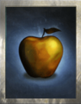
We're experimenting with showing the coloured borders arounded icons on Card and Storylet pages! This is being rolled out to Card pages for opted-in users as I type. If you'd like to opt in to the experiment, simply enable the Card Borders gadget in your preferences. (Admin note: now enabled by default --Asarta (talk) 10:09, 14 June 2021 (UTC))
If you have any issues with this experiment—whether opted in or not—or notice any bugs, please don't hesitate to let us know!
EDIT: This has been enabled for all Cards (including Autofire cards) and is currently being rolled out to Storylets.
Changes for Editors
While non-opted-in readers shouldn't notice any changes, this experiment brings two important changes editors need to be aware of:
- The images for Card pages should no longer use the
[[File:Placeholder2.png|right]]format. Instead, the {{Card}} template now takes an Icon parameter that takes the image name, e.g.|Icon = Placeholder2.png. - Instead of directly adding categories such as
[[Category:Silver Cards]]or[[Category:Bronze Storylets]], both the {{Card}} and {{Storylet}} templates take acolourparameter, which can take the valuesgold,silver,bronze,black,red, orwhite(default). This parameter will set the appropriate category as well as the image frame.
UPDATE: As of 12/08/2021, colourspurple,green,greenliving,blackzee, andblueare also available.
EDIT: {{Autofire}} and {{Storylet}} now also take Icon parameters that should be used instead of [[File:Placeholder2.png|right]].
